Deployment metrics
The Cloud UI exposes a suite of observability metrics that show real-time data related to the performance and health of your Deployments. These metrics are a useful reference as you troubleshoot issues and can inform how you allocate resources. They can also help you estimate the cost of your Deployments. This document explains each available metric and where to find them.
Deployment analytics
The Analytics page contains a suite of metrics for a given Deployment. This page includes metrics that give you insight into the performance of both your data pipelines and infrastructure. Because metrics are collected in real time, you can use this page to detect irregularities in your pipelines or infrastructure as they happen.
To view metrics for a Deployment, open the Deployment in the Cloud UI and click Analytics. The following topics contain information about each available metric.
DAG and task runs
These metrics contain information about your Deployment's DAG runs and task runs over a given period of time.
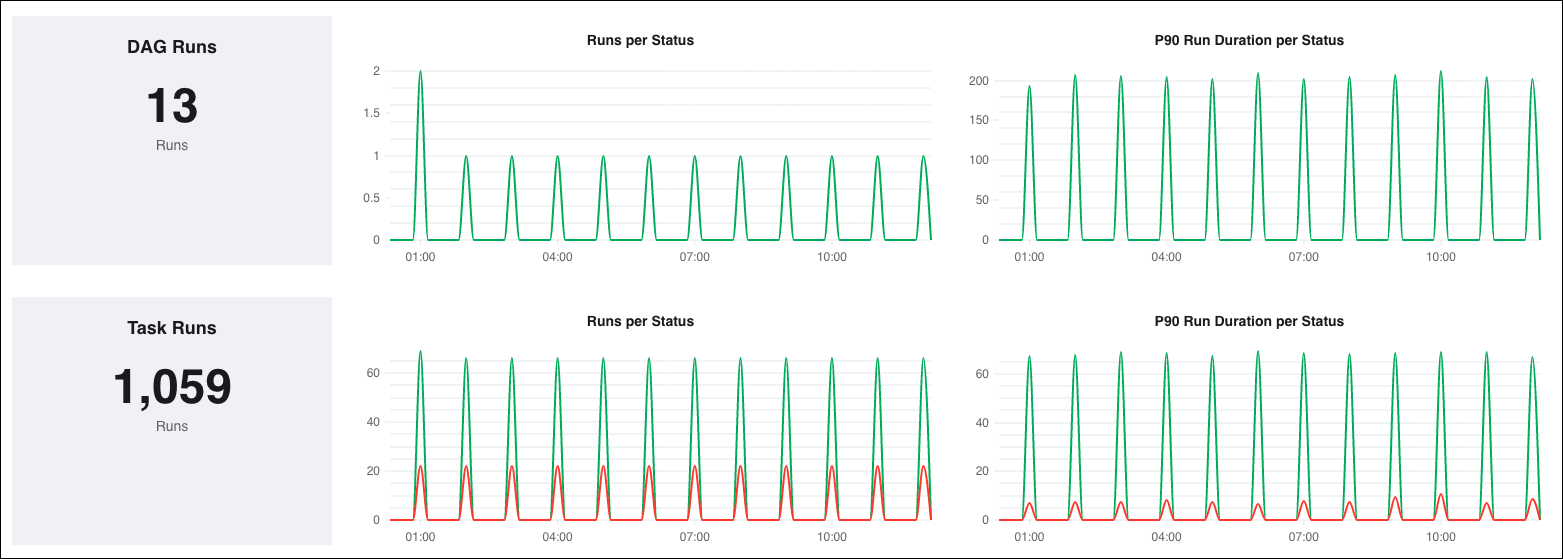
Available metrics
DAG/ Task Runs: This metric graphs the total number of DAG/ task runs.
Runs per Status: This metric graphs the number of failed and successful DAG/ task runs, plotted based on the DAG/ task run start time. Use this metric to see exactly when recent DAG/ task runs succeeded or failed.
cautionThe DAG runs metric does not record DAG run timeouts as failed runs. To see timed out DAG runs, you must go into the Airflow UI to check on the statuses of each DAG run there.
P90 Run Duration per Status: This metric graphs the 90th percentile of execution times for DAG/ task runs, plotted based on the DAG/ task run start time. In the example above, the P90 Run Duration per Status for successful DAG/ task runs at 5:00 was 34 seconds, which means that 90% of those DAG/ task runs finished in 34 seconds or less.
This metric can both help you understand how your pipelines are performing overall, as well as identify DAG/ task runs that didn't result in a failure but still took longer to run than expected.
Airflow workers and schedulers
These metrics contain information about the Kubernetes Pods running your workers and schedulers. Different worker and scheduler Pods will appear on these charts as differently colored lines.
Hover over the graph to view a graph legend. If a given worker queue spins a worker down and back up again within a given interval, the newly spun up worker appears as a new color on the graph.
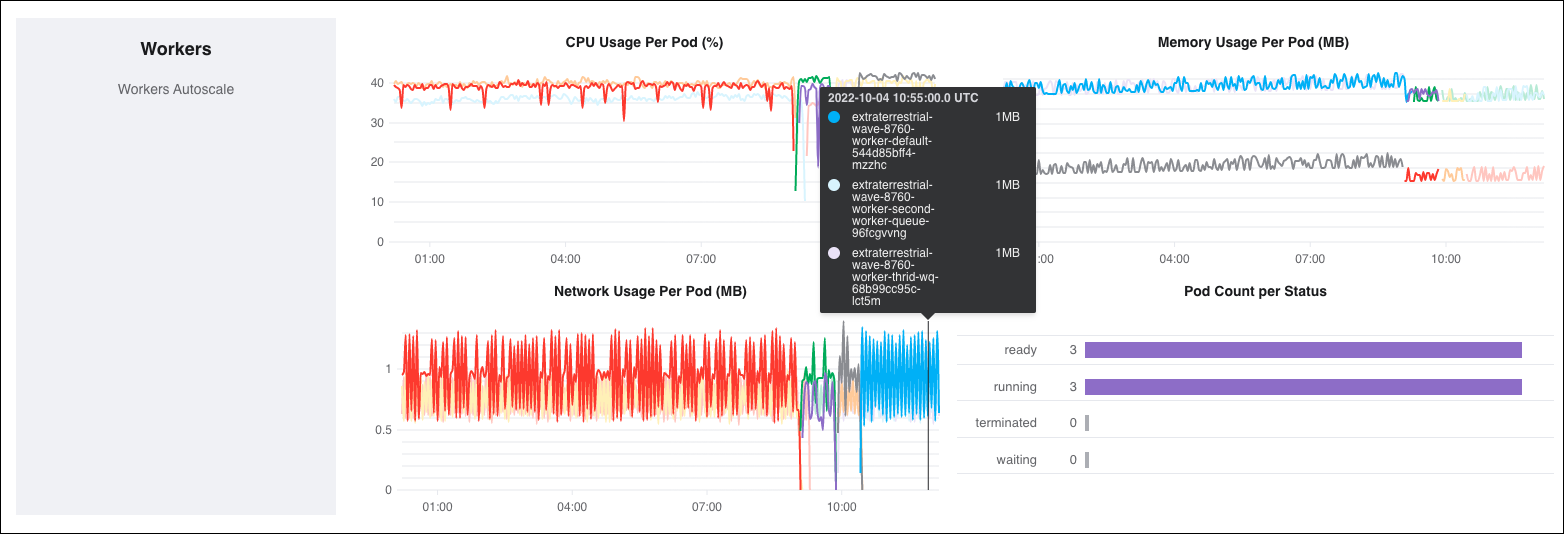
Available metrics
- CPU Usage Per Pod (%): This metric graphs the peak CPU usage for all workers and schedulers for a given interval. Different worker and scheduler Pods appear as differently colored lines on this chart. For scheduler metrics, the maximum allowable CPU for each scheduler Pod appears as a dotted red line.
- Memory Usage Per Pod (MB): This metric graphs the peak memory usage for all workers and schedulers for a given interval. Different worker and scheduler Pods will appear as differently colored lines on this chart. This metric should be at or below 50% of your total allowed memory at any given time. For scheduler metrics, the maximum allowable memory for each scheduler Pod appears as a dotted red line.
The number of workers per Deployment autoscales based on a combination of worker concurrency and the number of running and queued tasks. This means that the total available CPU and memory for a single Deployment may change at any time.
Network Usage Per Pod (MB): This metric graphs each worker/ scheduler Pod's peak network usage over time. Sudden, irregular spikes in this metric should be investigated as a possible error in your project code.
Pod Count per Status: This metric graphs the number of worker/ scheduler Pods in a given Kubernetes container state. Because Astro operates on a one-container-per-pod model, the state of the container state is also the Pod state. For more information about container states, read the Kubernetes documentation.
If a pod is stuck in a
Waitingstate, it could indicate that your Deployment did not successfully pull and run your Runtime image.Scheduler Heartbeat (Scheduler Only): A scheduler emits a heartbeat at a regular rate to signal that it's healthy to other Airflow components. This metric graphs a scheduler's average heartbeats per minute over a given time.
On average, a scheduler should emit ~11-12 heartbeats per minute. A scheduler is considered "unhealthy" if it has not emitted a heartbeat for over 1 minute. The lack of a scheduler heartbeat is expected during a code push, but erratic restarts or an "Unhealthy" state that persists for a significant amount of time is worth investigating further.
Pools
These metrics contain information about your Deployment's configured Airflow pools. They can give you insight into how your DAGs are handling concurrency.
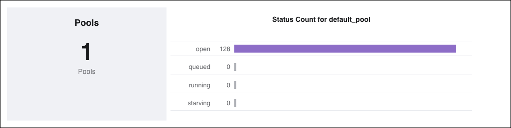
Available metrics
Status Count for
<pool-name>: This metric graphs both the number of open slots in your pool and the number of tasks in each pool state:Open: The number of available slots in the pool
Queued: The number of task instances which are occupying a pool slot and waiting to be picked up by a worker
Running: The number of tasks instances which are occupying a pool slot and running
Starving: The number of tasks that can't be scheduled when there are 0 available pool slots
A large number of starving tasks could indicate that you should reconfigure your pools to run more tasks in parallel.
Deployment health
Deployment health appears as a real-time status at the top of your Deployment's information page. Deployment health is meant to show whether or not the most important components within your Deployment are running as expected.
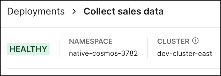
Deployment health can have one of two statuses:
Healthy (Green): The Airflow webserver and scheduler are both healthy and running as expected.
Unhealthy (Red): This status can mean one of two things:
- Your Deployment was recently created and the Airflow webserver and scheduler are still spinning up.
- Your Deployment's webserver and/or scheduler are restarting or otherwise not in a healthy, running state.
If your Deployment is unhealthy, check the status of your tasks and wait for a few minutes. If your Deployment is unhealthy for more than five minutes, review the scheduler logs in the Cloud UI or contact Astronomer support.
Deployment overview
Each Deployment includes four high-level performance charts about the default worker queue which you can view from both the Deployments menu and a Deployment's Analytics page. They include:
- DAG runs
- Task Instances
- Worker CPU
- Worker Memory

The data in these four charts is recorded hourly and is displayed in both UTC and your local browser timezone. Each bar across all graphs covers a complete hour while the entire time window for a single graph is 24 hours. For example, a single bar might represent 16:00 to 17:00 while the entire time window of the graph might represent Nov 1 16:00 to Nov 2 16:00.
The data for the most recent hour is for the hour to date. For example, if you are looking at this page at 16:30, then the bar for the 16:00-17:00 hour interval would show data for 16:00-16:30.
These charts serve as high-level reports for your default worker queue that you can investigate further.
The following sections describe each of the 4 available charts.
Total DAG runs
The DAG Runs metric records successful and failed DAG runs over hour-long intervals. A DAG run is defined as an instantiation of a DAG at a specific point in time.
You can hover over each bar to see the corresponding hour interval displayed in both UTC and your local timezone. Below that, you can see the number of successful DAG runs and the number of failed DAG runs. If a bar is partially or fully red, it means that one or more DAG runs failed within that hour interval.
The bolded value above the graph denotes the total number of DAG runs that have been executed in the last 24 hours.
Task instances
The Tasks chart records successful and failed task instances over hour-long intervals. A task instance is defined as an instantiation of a task at a specific point in time.
You can hover over each bar to see the corresponding hour interval displayed in both UTC and your local timezone. Below that, you can see the number of successful and failed task instances. If a bar is partially or fully red, it means that one or more task instances failed within that hour interval.
The bolded value above the graph denotes the total number of tasks that have run in the last 24 hours.
Resource usage
The Worker CPU and Worker Memory charts in the Cloud UI provide visibility into the resources being consumed by the workers in your Deployment as measured by CPU and memory consumption.
Worker CPU records the peak CPU usage, while Worker Memory records the peak memory usage by worker nodes over hour-long intervals. The bolded values above each graph show the maximum CPU/ memory usage by a single worker at any point in time over the last 24 hours.
A known issue with Celery might cause worker memory allocation to increase without a corresponding increase in task count or DAG memory use. To correct this issue, redeploy your code without making any changes to restart the Celery worker and reset memory requests. See Deploy code to Astro. This issue should not affect your tasks or cause OutOfMemory (OOM) errors. If you experience complications, contact Astronomer Support.
DAG runs
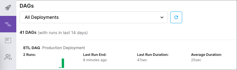
You can view key metrics about recent DAG runs using the DAGs page in the Cloud UI. This page shows DAG runs from the last 14 days across either all Deployments or a specific Deployment in a Workspace. For a given DAG, the DAGs page shows:
Total DAG runs over the last 14 days, expressed as a bar chart.
Each bar in the chart represents an individual DAG run. A bar's color represents whether the DAG run was a success or a failure, while its length represents the total duration of the DAG run. If there are more than 14 DAG runs in the last 14 days, then the chart shows only the 14 most recent DAG runs.
Last Run End: The ending time of the DAG's most recent DAG run, expressed relative to the current time.
Last Run Duration: The duration of the DAG's most recent DAG run.
Average Duration: The average Duration of all DAG runs from the last 14 days.
If a DAG run for any given DAG has not run in the last 14 days, then it will not appear in the DAGs view.
Additionally, the astronomer_monitoring_dag will never appear in this view even if it ran in the last 14 days.
To access the DAGs page, you can either click the DAGs icon in the UI or click View DAGs on a Deployment's information page.
Export Airflow metrics to Datadog
Export over 40 Airflow metrics related to the state and performance of your Astro Deployment to Datadog by adding a Datadog API key to your Deployment. These metrics include most information that is available in the Cloud UI as well as additional metrics that Datadog automatically collects, including number of queued tasks, DAG processing time, frequency of import errors, and more. For a complete list of supported metrics, see Data Collected in Datadog documentation.
Astro does not export any service checks to Datadog. Information about the general health of your Deployment is available only as part of the Cloud UI's Deployment health metric.
- Create a new Datadog API key or copy an existing API key. See API and Application Keys.
- In the Cloud UI, select a Workspace and then select an Astro Deployment for which you want to export metrics.
- Create a new environment variable in your Deployment with the Datadog API key from step 1:
- Key:
DATADOG_API_KEY - Value:
<Your-Datadog-API-key>. Select the Secret? checkbox. This ensures that your Datadog API key is saved securely and is not available to Workspace users in plain text.
- Key:
- Click Save variable.
After you complete this setup, Astro automatically launches a sidecar container in your Deployment that runs DogStatsD. This container works with your Deployment's existing infrastructure to export Airflow metrics to the Datadog instance associated with your API key.
View metrics in Datadog
- In the Datadog UI, go to Metrics > Summary.
- Search for metrics starting with
airflowand open any Airflow metric. - In the Tags table, check the values for the
namespacetag key. The namespaces of the Deployments you configured to export logs should appear as tag values.
To check the health of a Deployment's DogStatsD container, open the datadog.dogstatsd.running metric in the Datadog UI. If the Deployment's namespace appears under the metric's host tag key, its DogStatsD container is healthy and exporting metrics to Datadog.
Astro usage
Use the Usage tab in the Cloud UI to review the number of successful task runs across Deployments in your Organization. Astro is priced based on successful task runs, so this view can help you monitor both Astro cost as well as Airflow usage in aggregate.
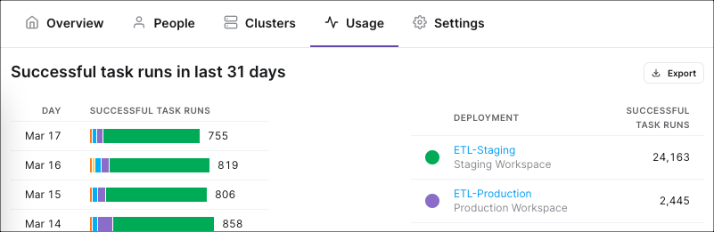
The bar chart on the left shows your Organization's total task runs per day for the past 31 days, with each day's volume sorted by Deployment. Each color in the bar chart represents a different Deployment. To see each Deployment's number of successful task runs for a given day, you can hover over the bar chart for that day with your mouse.
The legend on the right side of the menu shows the colors used for each Deployment. This legend shows each Deployment's total sum of successful task runs over the last 31 days. The daily numbers on the left bar chart add up to the monthly total per Deployment on the right.
To export this data as a .csv file, click the Export button above the legend.