View lineage on Astro
The Lineage tab in the Cloud UI can help you troubleshoot issues with your data pipelines and understand the movement of data across your Organization.
From the Lineage tab on Astro, you can access the following four pages:
- Explore: A real-time overview of all jobs that emit data lineage across your Organization. A job can be an Airflow task or any other process configured to emit lineage data to Astronomer, such as a Spark job.
- Datasets: A real-time overview of all recent datasets that your DAGs have read or written to.
- Issues: A view of potential issues or statistical inconsistencies related to your jobs or datasets.
- Lineage: A graph view that visualizes data lineage.
- Integrations: A view of your current data lineage integrations.
You can use these pages to diagnose issues that may be difficult to troubleshoot in other environments. For example, if an Airflow task failed because a database schema changed, you can use the Lineage page on Astro to determine which job caused the change and which downstream tasks failed as a result.
For more information on data lineage and related concepts, see Data lineage concepts.
All members of your Astro Organization can view the Lineage tab regardless of their Workspace permissions. The Lineage tab could contain plain-text SQL and Python code from any system that emits lineage data to Astro. If this is a security concern for your organization, reach out to Astronomer support.
This functionality is early access and under active development. If you have any questions or feedback about this feature, contact Astronomer support.
Prerequisites
To view lineage data for Deployments, you must configure Airflow and your external systems to emit lineage data. See Enable data lineage for external systems.
View the lineage graph for a data pipeline
You can use the search field at the top of the Cloud UI to view the lineage graph for one of your data pipelines, search for a DAG, task, or dataset. You can also search for jobs from other tools with lineage integrations, including dbt or Spark.
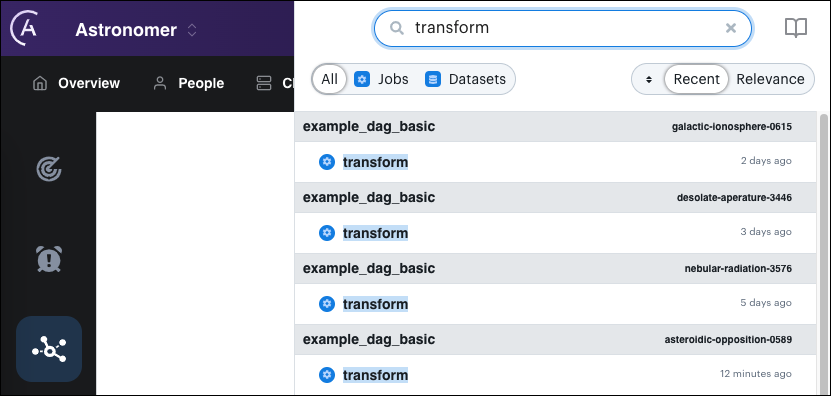
The search results include the namespace that emitted the matching event. When an Astro Deployment emits the lineage event, the namespace matches the Deployment namespace shown in the Deployments page of the Cloud UI. Clicking a search result opens the Lineage page and shows the lineage graph for the selected job or dataset. You can also access the lineage graph for a recent job run in the Explore page below Most Recent Runs.
The Lineage page shows lineage data only for the most recent run of a given data pipeline. To explore lineage data from previous runs, see Compare lineage graphs from previous runs.
By default, when you access the Lineage page from the left menu, the last lineage graph you viewed is displayed. If you go directly to the Lineage page without viewing a lineage graph, no lineage graph data is displayed. If this happens, you can access a job run using the search bar or use the Explore page to populate the Lineage page with data.
A lineage graph with a single node indicates that the job you selected didn't emit any information about input or output datasets. Typically, this occurs when an Airflow task isn't using a supported Airflow operator. You can still view the duration of this job over time.
Navigating the lineage graph
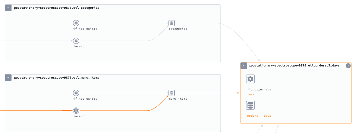
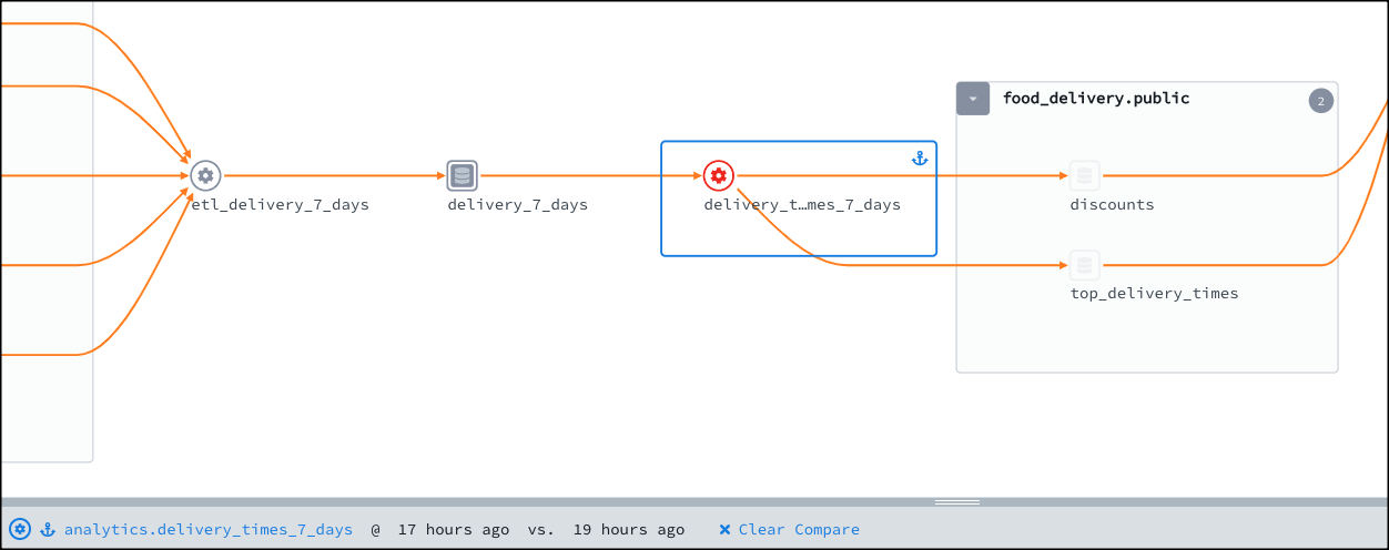
In the Lineage page, Astronomer renders your data pipeline as a directed graph of job and dataset nodes:
- A job node represents an individual step in your data pipeline, such as an Airflow task or a Spark job.
- A dataset node represents a data source that a job interacts with, such as a Snowflake database.
Directed vertices connect jobs to datasets and datasets to jobs. Two jobs or two datasets can't be connected by a single vertex.
In the following example, insert is a job that exists as part of the etl_menu_items group. A vertex connects insert to the menu_items dataset to indicate that insert interacted with data in this dataset.
To navigate larger graphs, click and drag your mouse across the screen. To zoom in on a specific section of a graph, you can either scroll your mouse or click the magnifying glass icons in the information pane on the lower-left of the screen.
Click or hover over a node to view the following information about the dataset or job:
- Namespace: The namespace of the Deployment in which the job ran.
- Name: The DAG ID and task ID of the job, formatted as
<dag-id>.<task-id>. - Run information (job only): Metadata and status information about the job run.
- Quality checks (dataset only): The status of a dataset's data quality checks.
Click a node to populate the information pane with detailed information about the job or dataset. For more information about using this view, see View metrics for a specific job or dataset.
Access the graph legend
Click the key icon in the information pane to open the graph legend. The legend provides a visual guide to help you distinguish between:
- Job nodes and dataset nodes.
- User-selected and unselected nodes.
- Completed, running, failed, and aborted jobs
- Completed, running, failed, and aborted dataset checks
Dataset and job statuses are based on checks of metadata attached to your data. To see the specifics of why a dataset failed, click the failed dataset node and check the Quality tab in the information pane. To check why a job failed, check the source of the job, such as your DAG or task.
Use the Cluster Mode and Edge Drawing Mode settings to customize how the graph appears in the legend.
View metrics for a specific job or dataset
On the Lineage page, the following tabs appear below the lineage graph:
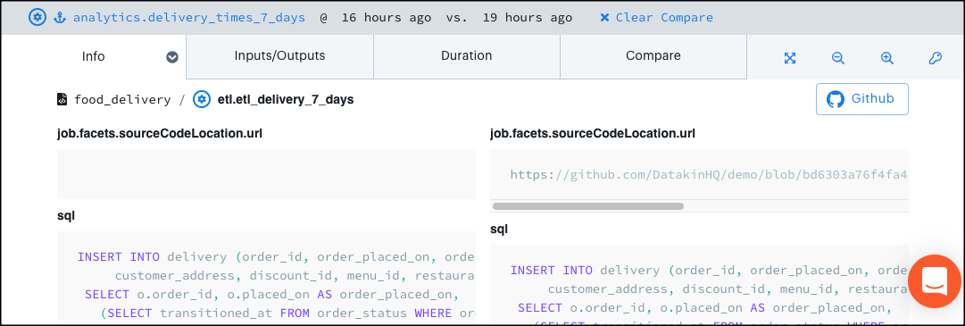
- Info: Shows the code for a job or the schema for a dataset. Also shows the difference between job runs when you create a comparison in the Compare tab.
- Inputs/Outputs: Shows the inputs and outputs for a job or dataset. This information is equivalent to the upstream and downstream nodes in the graph view.
- Quality (Dataset only): Shows the data quality checks performed on each element of a dataset. Expand a listed dataset element to view more information about a specific quality check.
- Duration (Job only): Shows the duration of upstream job runs in descending order. To view job run durations relative to the average duration across all job runs, click the blue arrow next to the name of your most recent job run and then click Maximize at the bottom of the list.
- Compare (Job only): Shows other job runs for the currently selected job. Select any two job runs and go to the Info tab to view code changes between the two job runs. Use this tab to compare job runs with different statuses or run times to measure performance between code changes.
Check for data quality
When you select a dataset from the lineage graph, the Quality tab appears in the information pane. By default, this tab shows a list of columns that correspond to your dataset.
If you have a Great Expectations integration, this tab also contains charts that show:
- The number of rows in your dataset over time.
- The amount of megabytes consumed by your dataset over time.
- Successes and failures of data quality checks.
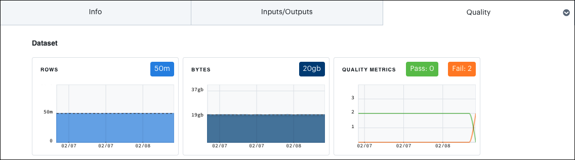
These charts display data for the past 20 job runs.
Use the Quality tab to detect unexpected changes or statistical variance in your dataset that could indicate a problem. The following topics explain each available chart in the tab.
Rows
The Rows chart shows the total number of rows in the dataset over time. A significant change in rows can occur naturally. For example, a rapid increase of customer orders occurs during the holiday season. However, it can also indicate an error in an upstream job, especially if it is sudden or unexpected.
Bytes
The Bytes chart shows the total size of the dataset over time. A sudden increase in dataset size usually indicates that something has changed in the definition of the data. For example, a new column might have been added to your table containing the description of an order, where before it contained only part numbers and quantities.
Quality metrics
The Quality Metrics chart shows the pass or fail status of quality assertions in a Great Expectations suite. To see details on the assertions that have passed or failed, hover over a point on the chart.
Distinct count (Column-level)
The Distinct Count chart shows the total number of distinct values for a given column.
Distinct count can sometimes grow unexpectedly. For example, a successful marketing campaign might suddenly create a set of new customer_id values in an order table. However, it can also suggest an underlying problem if, for example, a menu_item_id field shows that thousands of new menu items have been added overnight.
Null count (Column-level)
The Null Count chart shows the number of rows in the dataset where a given column contains a null value.
A large number of null values can be normal, such as when most orders on your system do not include a discount. However, an increase in null values in a column with standard data such as quantity might indicate an issue.
Quality metrics (Column-level)
The Quality Metrics chart shows the pass or fail status of quality assertions in a Great Expectations suite for a given column.
To see details on the assertions that have passed or failed, hover over a given point on the chart.
Compare lineage graphs from previous runs
The Compare tab shows a list of past job runs for a given job. Using the compare tab, you can select pairs of job runs to see what changed in your pipelines between the two runs.
Click a job on the graph.
Click the Compare tab to see a list of all previous job runs for the selected job. The colored bar above a job run indicates the job run duration and run state. Job runs with a run state of
COMPLETEhave a blue bar, and job runs with a run state ofFAILEDhave an orange bar.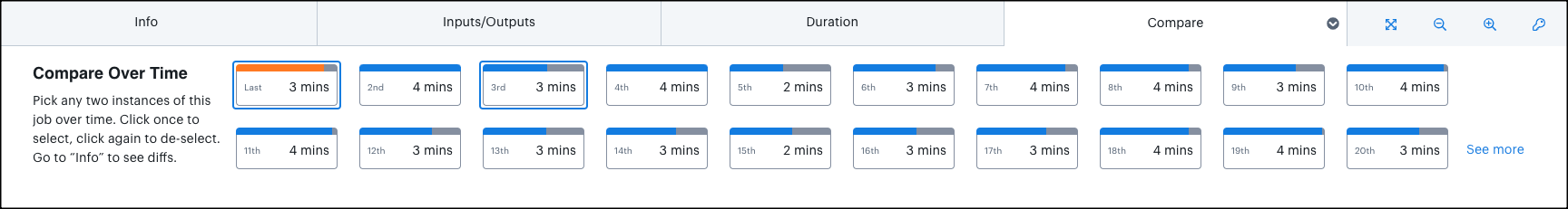
Select any two job runs to open the comparison view for your graph. In this view:
- Jobs and datasets that experienced a code change between the time of your selected job runs are highlighted on the graph.
- Jobs and datasets that stayed the same between job runs are shaded.
- Your selected job is shown with an anchor icon and a blue box.
- The bottom of the graph shows information about your comparison.
Select a job or dataset that experienced a code change.
Click the Info tab. Instead of showing a single code source, this tab now shows the code source from both of your compared job runs. Use this information to determine what code change might have caused downstream errors.
View a summary of issues across Deployments
The Issues page contains metrics that can help you identify data pipeline behavior irregularities.
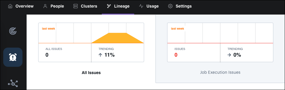
The Issues page identifies the following issues:
- Job Execution Issues: A job execution issue occurs when a job emits an error that it did not successfully complete. This metric is only available for Deployments using Runtime 5.0.0+.
- Job Duration Issues: A job duration issue occurs when a job run's duration differs by more than three standard deviations from the average run time for that specific job.
- Data Quality Issues: If you integrate with Great Expectations, an open source data quality tool, this metric will track issues generated by expectation quality checks for datasets. Use this tab to detect data quality failures that could indicate an upstream problem.
View a summary of past runs
By default, the Lineage page shows the last lineage graph you accessed. To view metrics about all of your job runs and access lineage graphs, click Explore on the left sidebar. This page is structured similarly to the Airflow UI calendar view. It provides a list of your most recent runs, as well as a calendar that shows all runs over the last year.
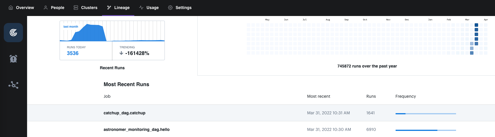
Airflow tasks appear as jobs with the name <dag_id>.<task_id>. For example, the job example_dag_basic.extract represents the extract task running within the example_dag_basic DAG.
This view can help you get a better sense of the scope of your lineage integrations. It can also help you confirm that a recent run was picked up by the lineage backend as expected.
View recently accessed datasets
Use the Datasets page to view a table of recent datasets that your DAGs have read or written to. This information can help you quickly identify dataset dependencies and data pipeline access requirements.
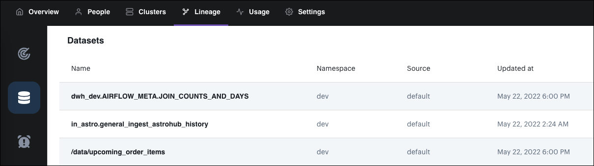
Each row in the table includes:
- The name of the dataset.
- The namespace of the job run that accessed the dataset.
- The type of job that interacted with the dataset.
- When the dataset was accessed.
Click on the name of a dataset to show its lineage graph.